 Newman Adesan
Showcase site for an architectural visualisation studio
Demiverse
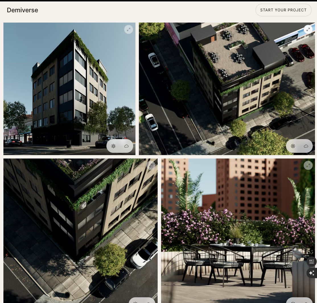
A portfolio site that presents the studio's projects as stills, day and night comparisons, 360° tours and film.
- Role
- Web developer
- Period
- Sep – Oct 2026
- Tools
Tools used: Next.js, TypeScript, Tailwind CSS, Photo Sphere Viewer, sharp
The problem
Demiverse produces architectural renders and walkthroughs. The site had to show heavy visual media well on phones without becoming slow or hard to update.
What I built
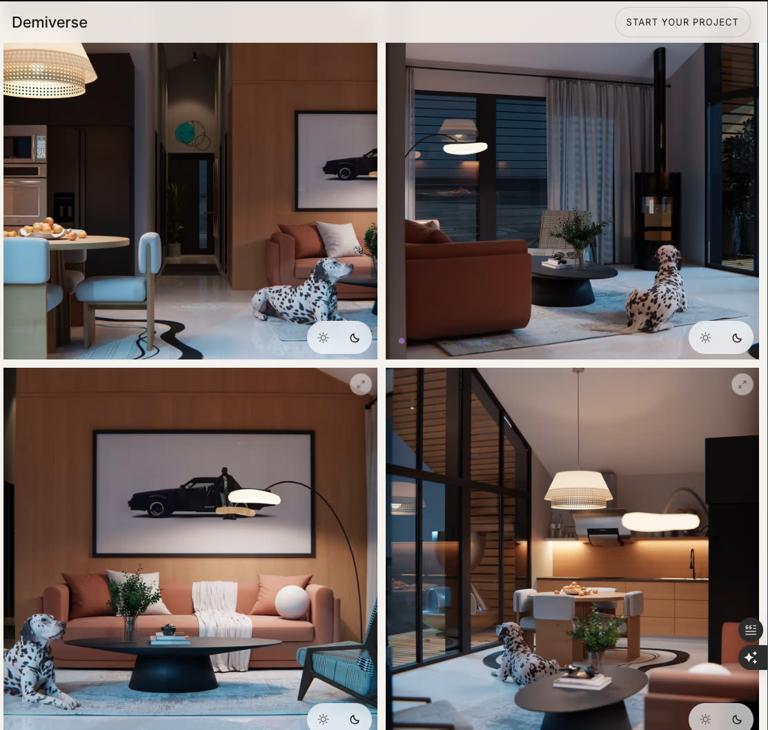
- Project pages for stills, day/night comparisons, 360° tours and film.
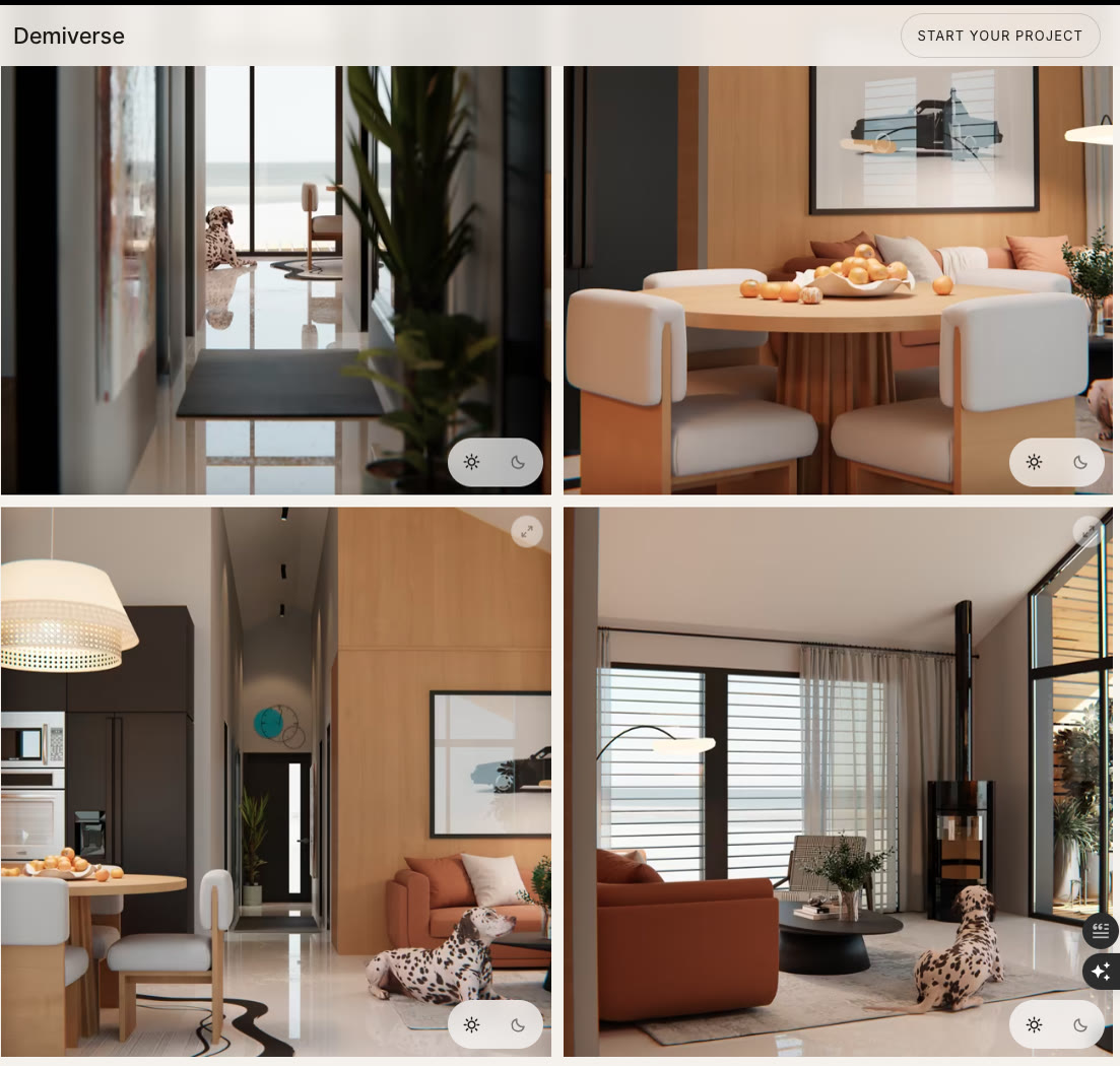
- Scroll-driven motion: a project hero that turns from day to night, and a home page sequence where the room's furniture rises as you scroll.
- A media pipeline, so a new project is added through configuration rather than new code.
- Delivered in 16 phases, each signed off by the founder.
- Scores 100 for accessibility on mobile Lighthouse.
Very large renders, loading fast
Architectural renders are huge, and the studio's clients open links on whatever phone they have, so I planned for an iPhone 7 with 2 GB of RAM and Safari 15.
On a phone like that the limit is memory as much as download size: a 2,560px render takes about 26 MB once decoded, however well it was compressed. A build script turns each raw render into AVIF and WebP at several widths, plus a tiny blurred preview. Each image is a <picture> with an AVIF source and a WebP fallback, because Safari 15 can't show AVIF. Accurate sizes attributes stop phones fetching desktop widths, which on the home page alone had been over-fetching 277 KB. Hover-only images are never requested on touch screens, and phones never request the home page's video at all.
Scroll that tells the time of day
The site's idea is that the day passes as you scroll.
On The Cabin's page the hero pins to the screen and its render crossfades from day to night across the pinned distance, finishing before the hero starts to leave. The page background follows: it holds at dusk through the opening sections, then turns to night over about one screen height, anchored to the shot where the pictures switch to their night versions, so background and images turn together. The background crossfade is pure opacity, which the browser can run without repainting, and text colours change in four steps rather than every frame, so it stays smooth on old phones. On the home page, the furniture in a room rises as you scroll. It looks like video but isn't: scrubbing a video by its playback time makes the browser decode from the nearest keyframe on every step, which no old phone does smoothly. Instead it is 60 WebP frames, 0.59 MB in all, drawn to a canvas only when the frame changes. A frame that hasn't arrived yet is skipped rather than cleared, so a slow connection looks like a pause, not a blank. Under a 4× CPU slowdown on a phone-sized screen it dropped 0 frames. Both effects share one scroll listener. With reduced motion switched on there is no pinning or scrubbing: the hero shows night with a day/night switch, and the home page shows the finished room as a still.
No white boxes while loading
Testing on a throttled 3G connection, I found some slots showing flat colour or white boxes while they loaded.
The blurred preview lived inside one image component, so it only reached images that went through it. Video posters, home tiles and the 360° preview each built their own element and had no preview at all. I moved the loading treatment into one shared frame component used by every image, video and canvas, and generated previews for the media that had none. I then audited all 13 kinds of media slot mid-load, on Slow 3G, at phone and desktop widths. All 13 show a blurred preview, with zero white boxes, and layout shift stays at 0.